
Care labels are not decorative extras. They are functional, legally significant, and directly tied to garment lifespan, customer satisfaction, and brand credibility. Poorly designed care labels fade, shrink, irritate skin, or become unreadable after washing—creating compliance risks and post-sale issues.
This guide explains how to design durable, legible, and production-ready care labels, with a focus on material choice, print method, layout, and long-term wash performance.
Why Care Label Design Matters More Than You Think
Care labels communicate essential information: washing temperature, drying method, ironing limits, fabric composition, and country of origin. If this information becomes unreadable, the label fails its core function.
From a compliance standpoint, unreadable or missing care information can expose brands to regulatory issues in many markets. From a customer perspective, unclear labels lead to garment damage and dissatisfaction.
For a broader understanding of their role, see
Care (Wash Instruction) Labels: A Must for Every Garment.
1. Choose the Right Label Material for Longevity
Material selection is the foundation of durability.
Common care label materials:
-
Satin: Soft, skin-friendly, ideal for underwear, babywear, and premium garments.
-
Taffeta: More rigid but highly durable; suitable for outerwear and workwear.
-
Cotton (printed): Natural feel, but requires correct ink and curing for wash resistance.
Technical consideration:
Softness and durability must be balanced. A very soft material with incorrect printing will fade quickly. A durable material with poor edge finishing may cause skin irritation.
2. Use Printing Methods Designed for Repeated Washing
Durability is not only about fabric—it depends heavily on the printing process.
Recommended approaches:
-
Resin-based or heat-set inks for high wash resistance
-
Controlled curing temperatures to prevent ink cracking
-
Adequate ink penetration without bleeding
Low-cost printing methods often fail after 5–10 wash cycles. A professionally produced care label should remain readable for the garment’s expected lifespan.
If you are comparing label technologies across product categories,
Woven Labels vs. Printed Labels Which One To Choose? provides useful context.
3. Prioritize Readability Over Visual Density
Care labels are informational tools, not branding surfaces.
Best practices for easy readability:
-
Minimum font size that remains legible after washing
-
High contrast (dark text on light background or vice versa)
-
Avoid ultra-light fonts or condensed typefaces
-
Sufficient line spacing to prevent ink merging
Overloading a small care label with excessive text is a common mistake. If multiple languages or detailed instructions are required, consider a book fold or multi-panel layout.
Related design pitfalls are covered in
5 Common Mistakes to Avoid When Designing Your Product Label.
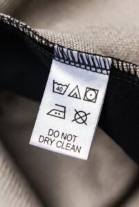
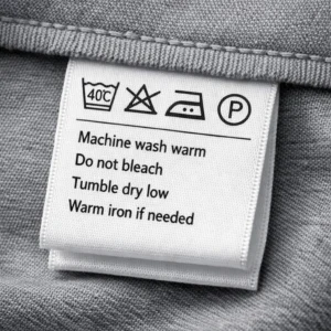
4. Use Standardized Wash Symbols Correctly
International wash symbols reduce language dependency and improve clarity.
Key points:
-
Use ISO-standard symbols only
-
Maintain consistent symbol sizing
-
Do not distort or stylize symbols for aesthetics
Incorrect or non-standard symbols can cause confusion and may not meet regional compliance expectations.
For symbol-specific guidance, refer to
Standard Symbols Used in Wash Instruction Labels.
5. Optimize Label Size and Fold Type
Label size directly affects readability and comfort.
Size considerations:
-
Too small → unreadable after washing
-
Too large → uncomfortable, often cut off by consumers
Common fold options for care labels:
-
Center fold (most common for neck placement)
-
End fold for side seams
-
Book fold for multilingual or extended instructions
Correct folding also improves sewing efficiency and reduces edge irritation.
6. Design for Real Garment Use, Not Just Screens
What looks clear on a monitor may not translate well to fabric.
Always account for:
-
Ink spread on fabric
-
Shrinkage after washing
-
Color shift between screen and print
-
Stitch lines overlapping text
A production-ready design considers how the label behaves after sewing and washing, not just during approval.
7. Test for Wash Performance Before Scaling
Before bulk production:
-
Wash-test samples at intended temperatures (30°C / 40°C / 60°C)
-
Check text clarity, ink fading, edge integrity
-
Evaluate comfort against skin after washing
Skipping testing often leads to costly remakes or customer complaints.
Final Thoughts: Function First, Always
A well-designed care label is:
-
Durable across repeated washes
-
Easy to read throughout the garment’s life
-
Comfortable against skin
-
Technically compliant and production-efficient
Design decisions should always be made with real-world garment use in mind—not just aesthetics. When durability and clarity are prioritized, care labels quietly do their job while reinforcing trust in your brand.
For brands building a consistent labeling system across products, combining care labels with correctly specified woven or printed labels ensures long-term scalability and fewer production issues.